Mason Wells:
Connecting with clients and displaying an impressive private equity portfolio is difficult –– thankfully user experience is our forte
Project Challenge
A dated, content heavy website made browsing difficult and slow. With a successful Buyout Fund in hand, Mason Wells, a Milwaukee-based private equity firm, needed a way to promote their services and success while intentionally connecting with business owners and intermediaries.
Project Solution
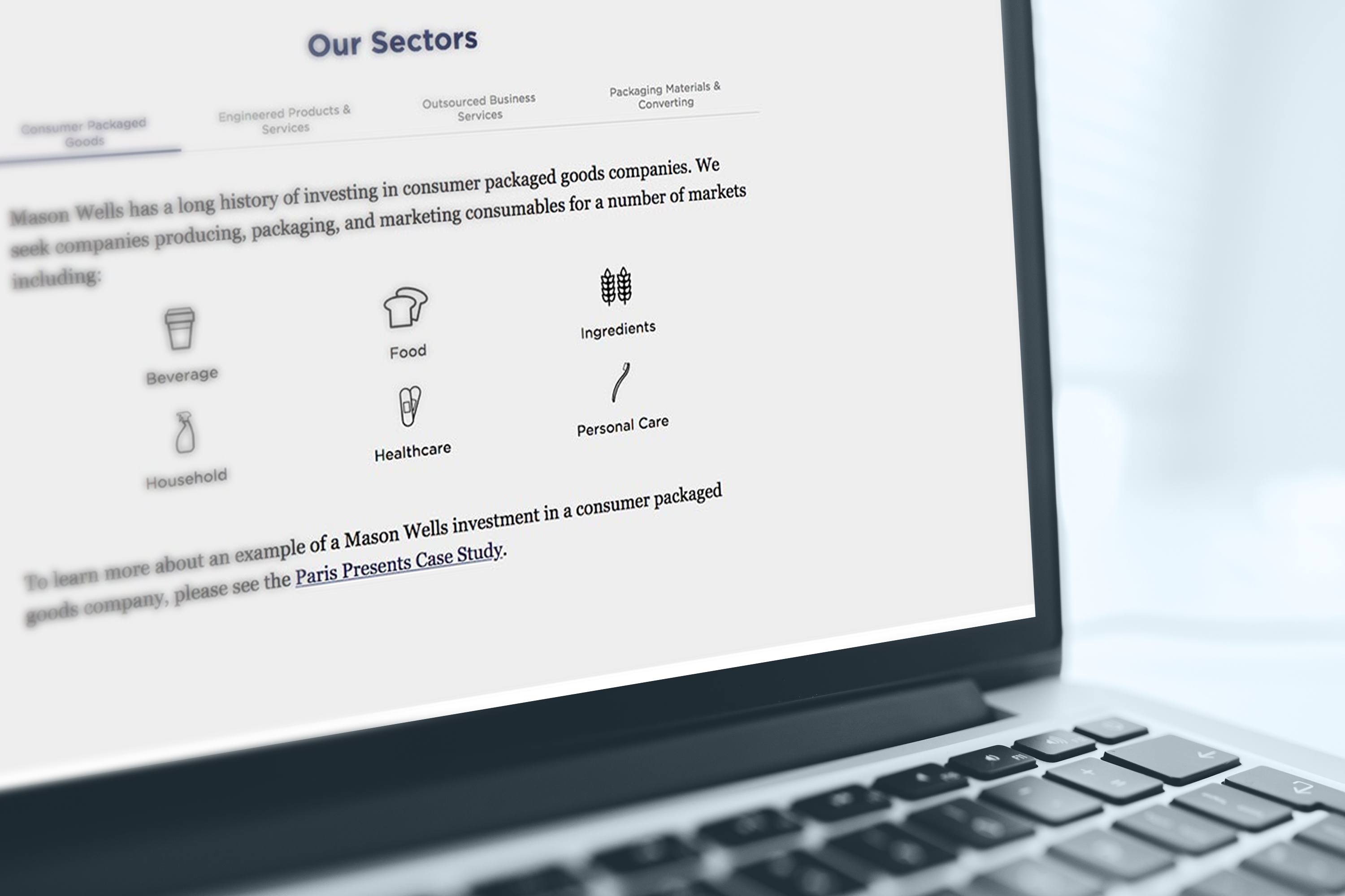
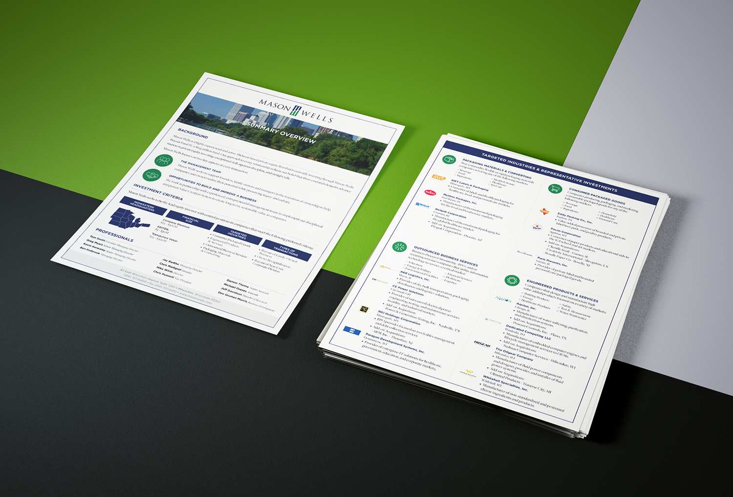
From a refreshed logo to clear, simple navigation, our work gave Mason Wells the look they needed to connect with people and promote their new fund and firm. We created unique, “choose your own adventure” business sector pages that individualized imagery for specific audiences to help keep visitors interested. Our clean iconography makes case studies dynamic, yet easy to browse and the print functionality on the team page gives clients a quick and easy way to stay in touch.
Services


We’ll miss you!
You’re about to leave our site to see some of our great work. Our wonderful clients control their websites once we finish the project, so things might look a little different now. Come back and see our work again soon!
I'll Hang Here

